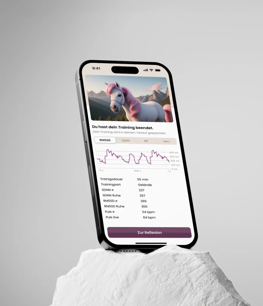
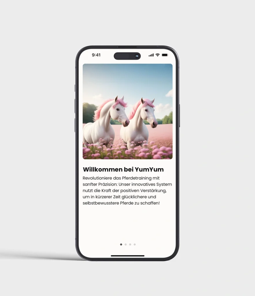
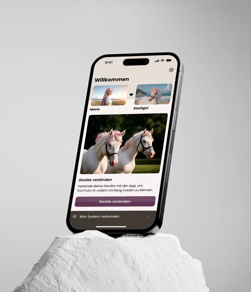
I developed the brand and corporate identity for an equestrian training product, along with the concept and design of an iOS app that syncs with training gadgets to provide performance insights and horse health data. The product supports positive reinforcement in horse training, promoting a balanced and trusting connection between horse and rider.
Challenge & Approach
As a research project, one of the main challenges was that the product itself was still in development. The project partners were testing how the mechanical components would function and how horses would respond to them. This required a flexible design process that could adapt as the product evolved.
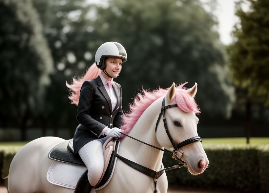
The app and branding needed to appeal to a very specific niche audience of both hobby and professional riders, mostly women, with a focus on the emotional bond and well-being of the horse. To reflect this, I created a feminine yet technically refined design language. Soft colors, warm imagery, and gentle shapes communicate empathy and care, while a clean, structured interface conveys innovation and precision. The result is a brand that unites emotional connection with technological progress in modern equestrian training.
Logo Development
For the logo name and design, I worked closely with the project partners, focusing on the interests of the target group. Since the name could not be finalized during the research phase, the project continued under the working title yumyum. During the process, I developed several logo concepts highlighting different qualities such as femininity, strength, value, and technical precision. Each version explored a unique balance between approachability, elegance, and boldness to help define the visual direction of the brand.