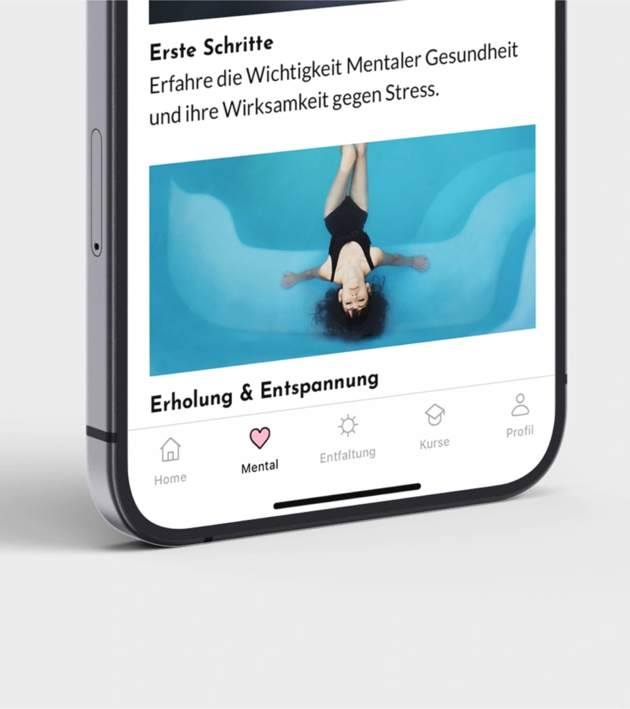
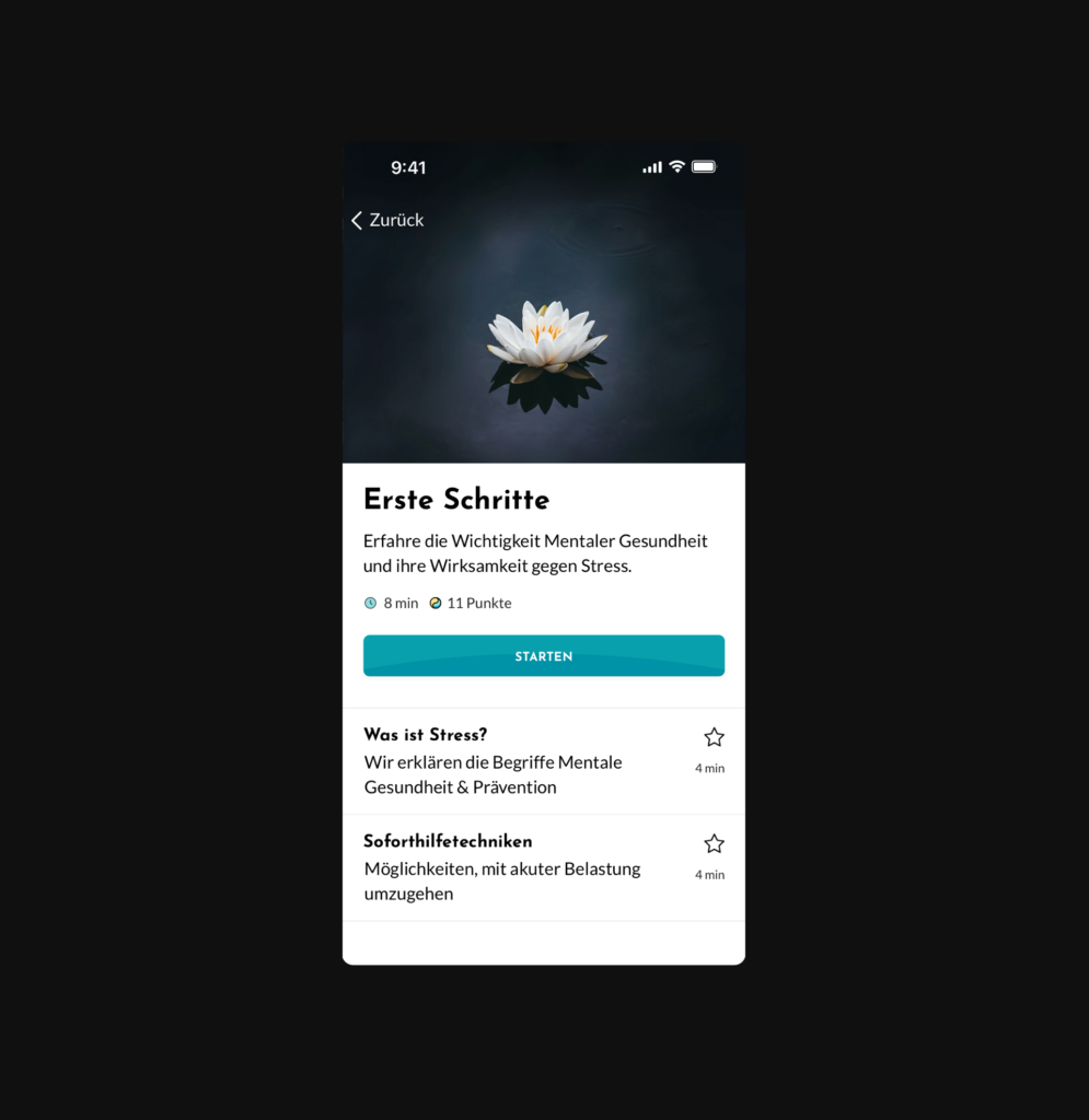
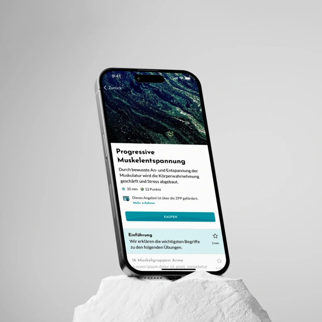
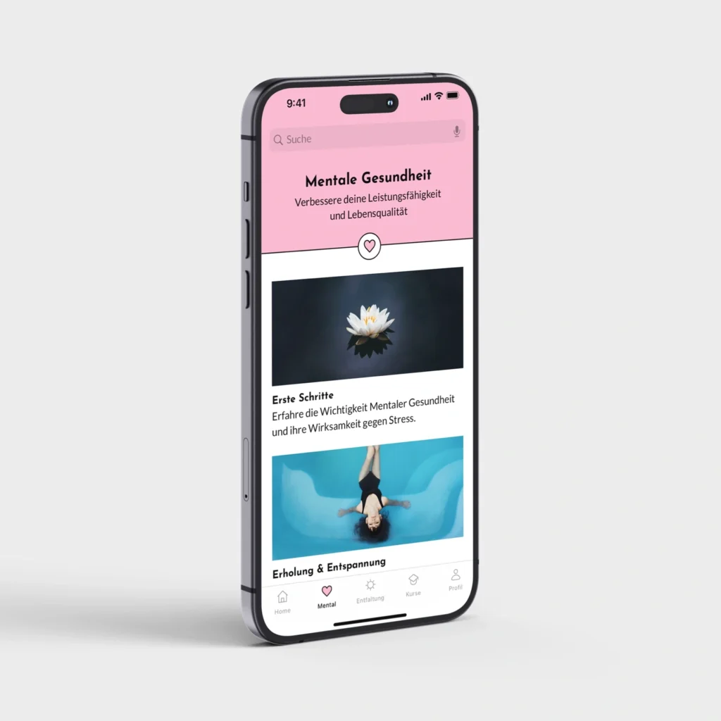
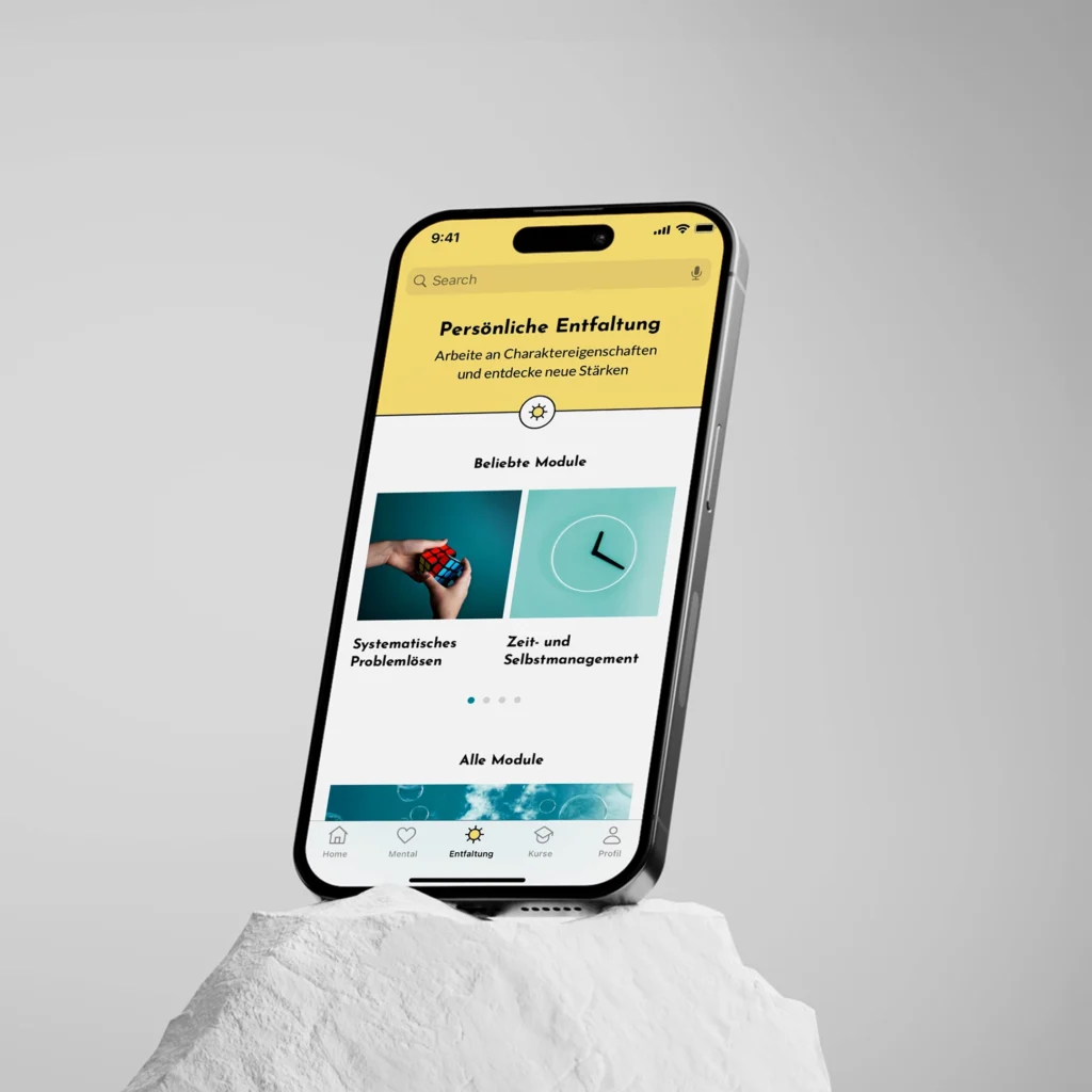
The Easy-Well app supports mental health and personal growth. I developed the logo, concept and UI design, featuring a calm, minimalist aesthetic with soft blues and ample white space.
Challenge & Approach
For the Easy‑Well app, the challenge was to craft a unified and meaningful brand experience from the ground up: logo, corporate identity, app UI/UX and visual assets. All while deeply understanding the user’s journey toward mental wellness.
To tackle this, I held in-depth interviews with the client to uncover their values and goals, then translated those into a cohesive visual language: soft blue tones, generous white space and a minimalist aesthetic that supports calm, clarity and growth. I designed the logo and identity, built the interface and user flows, optimized imagery and edited visuals by hand to ensure every screen felt polished and purposeful. The result: an integrated brand and app ecosystem that feels consistent, approachable and emotionally engaging across all touch-points.
Logo Symbolism
The Easy-Well logo weaves together three symbolic elements: a window, a semicolon, and two abstract characters facing each other. The window represents reflection and perspective—encouraging users to look both inward for self-awareness and outward for connection. The semicolon symbolizes continuity and resilience, reflecting that personal growth is an ongoing journey rather than a conclusion. The two characters facing each other embody the dialogue between one’s inner and outer world, reinforcing Easy-Well’s mission to balance self-understanding with engagement in life.