I developed a complete logo rebranding for let’s dev, a company specializing in custom software solutions. Working closely with the CEOs, I explored the company’s values and future vision to define a bold, flat, and modern brand identity. After testing multiple design directions that referenced technology and software development, we chose to evolve the existing logo into a cleaner, more confident form that reflects both continuity and growth.
Challenge & Approach
The process involved several design rounds and close collaboration with the company’s leadership to identify what truly represented the brand. The main challenge was to modernize the visual identity without losing its established recognition. Through iterative feedback sessions, I refined the design toward a solution that felt fresh yet familiar, professional yet approachable.
Logo symbolism
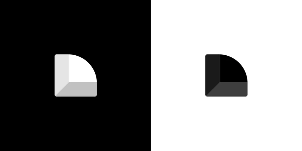
The final logo reinterprets the company’s previous mark using clearer geometry and stronger visual balance. Its structure is inspired by the Valknut, an ancient symbol of three interlocking triangles. Traditionally linked to cycles of life, death, and rebirth, it reflects the recurring process of software creation, testing, and deployment. The three connected forms also symbolize the unity of software, design, and user experience—core elements that define let’s dev’s holistic approach to digital innovation.