Let’s Push is a technical solution that enables businesses to send live push notifications to customers who have added a digital card to their mobile wallet, such as a status card or coupon. For this abstract and technical product, I created key visuals that highlight its unique selling points and designed the logo for the brand.
Challenge & Approach
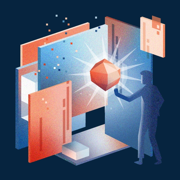
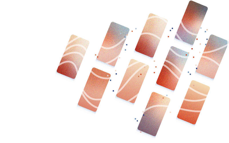
To make the product more relatable and visually engaging, I worked with warm blue and orange tones and gave the illustrations a nostalgic, familiar aesthetic using subtle noise and grain. The visual theme centers on push notifications, represented through abstract screens, message bubbles, and flowing organic lines that connect the technical function with an emotional, human touch.
Logo Symbolism
The logo combines multiple symbolic elements into a cohesive figurative mark. Two brackets form the outer shape, representing the developer background and the technical foundation of the product. Within the white space, the letter P emerges, standing for the wordmark “Let’s Push.” The P is shaped like a speech bubble, symbolizing communication and the connection established through push notifications between businesses and their customers.
Animation
I also created a short animated film to promote Let’s Push. The animation presents the key features of the product through a human-centered and engaging story, making the technical concept easy to understand and emotionally appealing to viewers.