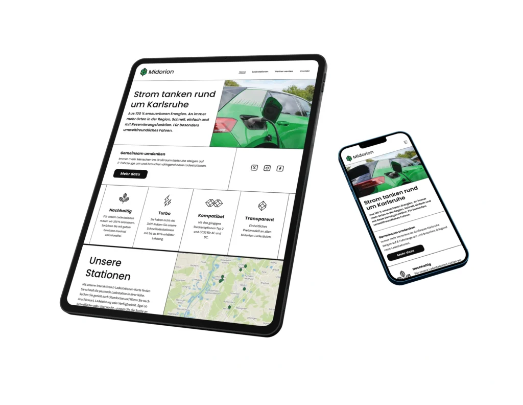
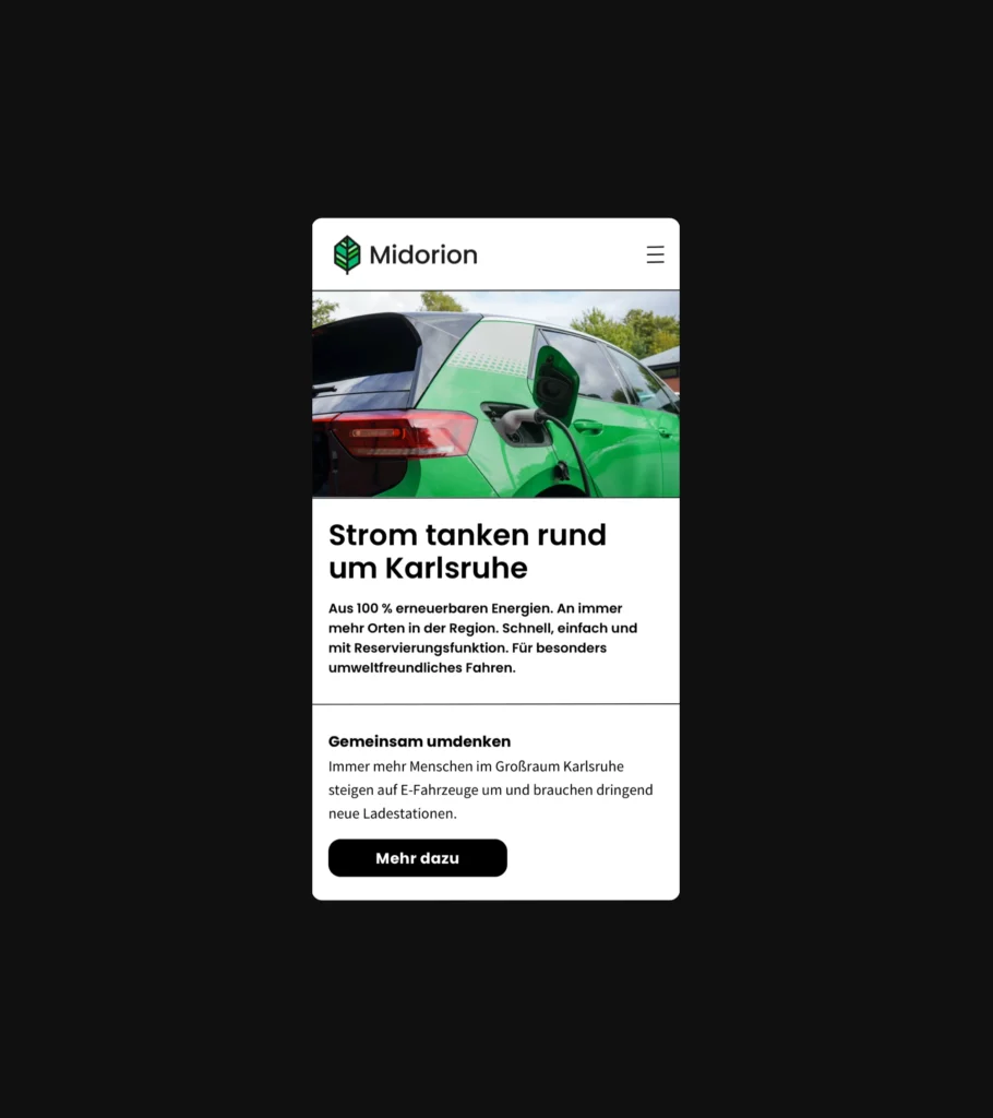
I designed the website midorion. io. They provide a network of public EV charging stations powered entirely by 100% renewable energy. I gave the platform an artistic grid design that is mirrored in the minimalistic logo and icons.
Challenge & Approach
The main challenge was to develop a completely new brand and design system, including a corporate identity that works consistently across different media. Together with the project partners, I also created a new name and logo that would represent the brand’s values and visual direction. The resulting design system combines white space, black lines, and green tones to create a modern and professional appearance with an artistic touch. The purity of white and green symbolizes sustainable energy, while the clean lines and sharp edges convey structure, clarity, and a contemporary feel across all platforms.
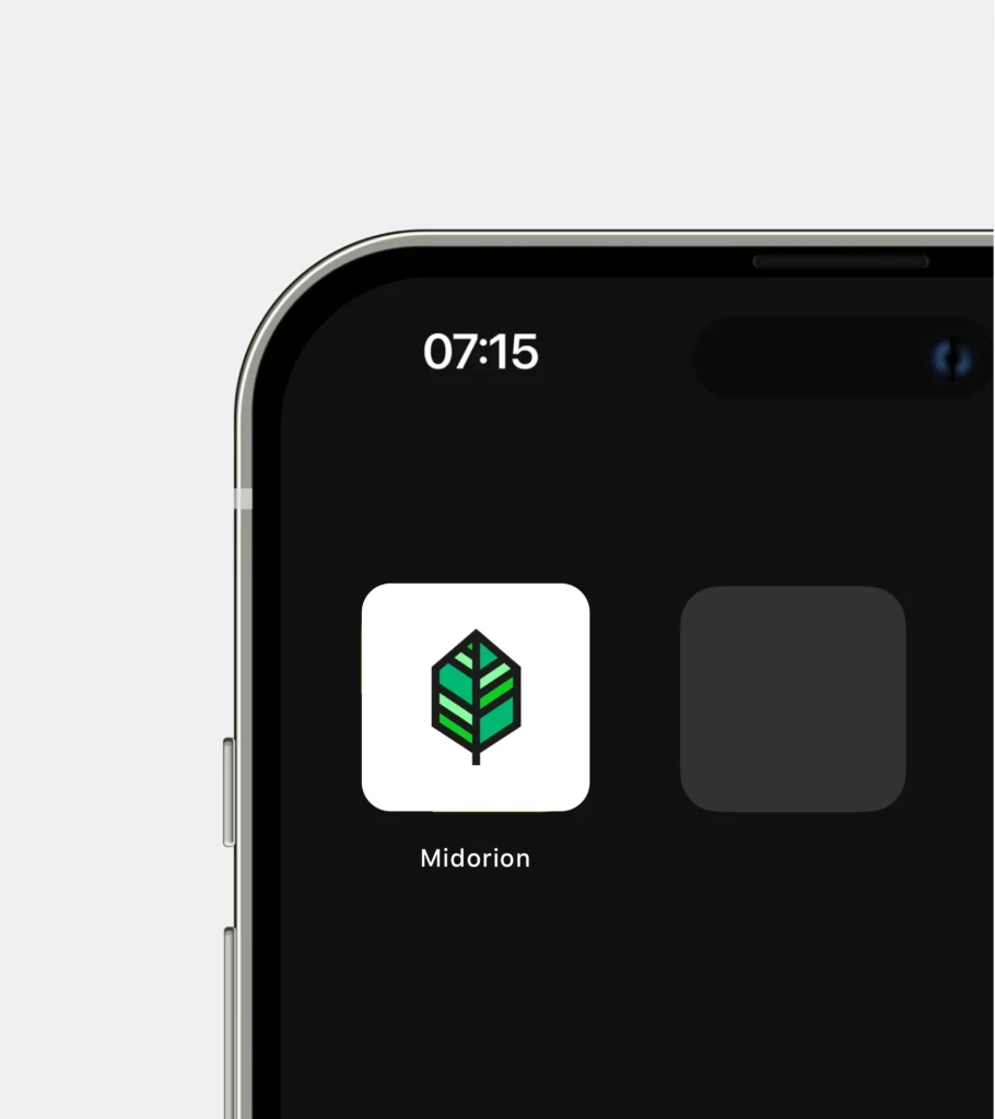
The Midorion logo combines linguistic meaning, visual symbolism, and typographic clarity to create a strong, modern brand identity. The name merges the Japanese word Midori (green) with the English word on (energy flow), reflecting the brand’s core promise: sustainable energy in motion. The color palette features a variety of green tones to convey the diversity of renewable energy sources and the natural essence of eco-friendly power. A stylized leaf in the logo serves as a universal symbol of sustainability and connection to nature.